Thursday 20 December 2012
House style/Colour Scheme.
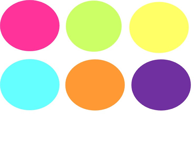
Above I have gathered six colours which I think will work the best with my magazine. As the genre is pop, i wanted to select bright, statement colours to make my magazine to stand out. Some of the colours are more pastel then they are bold because I also wanted to create a soft look also. I think that the six colours work well together and compliment one another. I believe that colours are a vital part in a magazine, especially a pop centred one. I'm yet to decide on my main house colour as I don't really want to just select one, I hope to incorporate all different colour instead of just one. The colours I have chosen also go with my target audience which are teenage girls, as the colours are both fun and quirky. However, because I have chosen the green and blue allows my magazine to offer itself out to a a larger target audience. Colour connotation is very important in a magazine, I would not use dark colours such as a burgundy red and it would be irrelevant to my theme.
Subscribe to:
Post Comments (Atom)

No comments:
Post a Comment